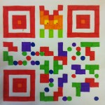
 Today we didn’t have access to computers so we were in the Art department. I had printed out everyone’s name as a QR code so we traced over these and tried to make them look pretty.
We talked about contrast, which is the difference between two colours or shades. There is a strong contrast between black and white, they are very different. There isn’t a great contrast between orange and yellow.
We also talked about how QR codes work and about how there is between a 7% and 30% redundancy rate. This means that, with the size of code we were working with, 7% of it could be wrong or hidden and the code could still scan. We worked out that our code was 21 squares by 21 squares which means 441 little squares. 7% of 441 is 30. This seemed quite a lot!
A lot of our pictures didn’t scan. We think it was because of the colours used – not enough contrast between the code and the background.