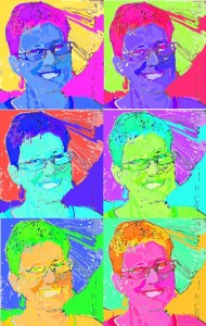
Today we played about a bit more with Hue and Saturation. First the class went and researched pictures by Andy Warhol. There were lots of images in the style of Andy Warhol so it took a little bit of clever searching to find authentic images by him.
 Next we found an image that we wanted to ‘Warhol’. Pupils chose objects (a tomato, an apple, a dog) and people (a different image of Marilyn Monroe, Einstein, Will Smith and some others)
We then turned our images into Warhol works of art! There is a great step by step tutorial available here. We didn’t worry too much about sizes and increased the canvas size later by multiplying the image height and width by 2 or 3 or 4. The most important thing to remember is to put each copy of your painted image onto a different layer.
Lastly we researched definitions of Hue and Saturation. Hue is another word for colour, like red or yellow or green or turquoise.

Saturation is how much of that colour there is. For example I could put a drop of red ink (the hue would be red) onto a piece of paper and it would spread out and turn the paper pink. If I put lots of drops of ink onto the paper it would turn more red.
There is also lightness (or brightness) which is how light or dark the colour is. If you see a red object in the dark it looks a different colour of red than if you turn a light on in the room. It will also seem a different shade of red if you take the object outside and look at it in the sunlight.
 Update: I did this class with the S5/6 class and used a pineapple as an example instead. I’m quite pleased with it 🙂 We also had a look at other ways to produce Andy Warhol style images, such as inverting the colours and using the oil painting effect but we all agreed that this didn’t look as good as the way we did it.
