Today we went over some design principles and revised some theory. We looked at Contrast, Shape, Movement, Line, Texture, Balance, Unity and Navigation
Contrast
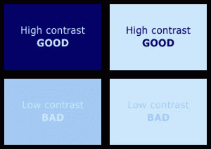
Good colour contrast makes text easier to read and makes it easier for people with colour blindness and visual impairments. 
If you have time, read more about colour blindness and see examples of how people can see different colours.
Shape
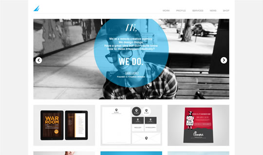
HTML web pages are generally designed in grids of columns but you can use interesting shapes including geometric shapes like squares, circles and triangles to communicate better. 
Movement
Visual movement is used to guide the user through the web site. This isn’t using animated gifs but pictures where your eye flows over to the important parts of the page. 
Line
Lines are used to divide up elements on your web page, to organise the space and to direct the user’s eye. The lines don’t have to be straight! 
Texture
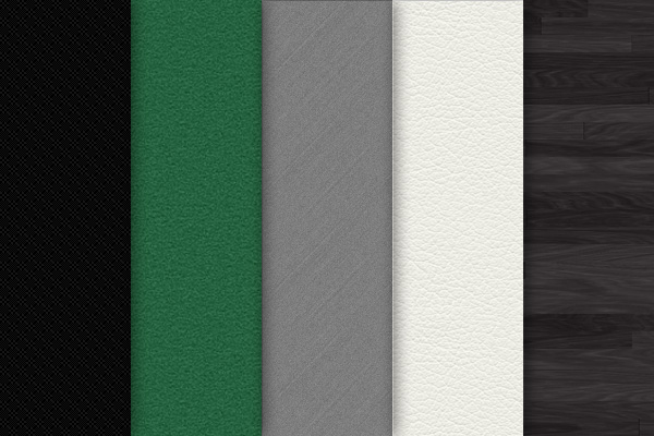
You can use texture to give the impression of a surface to your design and to make your website feel more immersive. 
Balance
Balance on a web pages involved making sure the left and right sides of the page are similar in terms of shape, size, colour, position and quantity 
Unity
Unity is grouping all the elements on a page that seem to belong together. 
Navigation
In some ways, navigation is one of the most important part of web design. If the visitors to your website can’t find the information they want then they will leave your site. Good navigation will make your visitors want to click and hang around your site a little longer.
Headings need to be clear to help your users navigate around the page. Buttons or navigation bars are usually used to go to the main sections of web sites.
For a long time there has been an informal design rule that you should be able to find the information you’re looking for on a site within three clicks. However its now felt that the usability of your site is more important than counting the clicks it takes to get there.
Links
You should avoid having web links with “click here” written as this makes it difficult for people with visual impairments using a speech reader

